Simplifying Global Shopping with Shipzee
This case study shows how we rebuilt a cross-border shopping platform from the inside out - making it faster, clearer, and easier to trust.

Wait… How Does This Work?
Shipzee’s concept was clever: let shoppers in Europe buy from U.S. stores without worrying about customs, hidden fees, or courier coordination.
But while the service worked behind the scenes, the experience didn’t match the promise.
Most users didn’t understand what Shipzee actually did. Delivery times felt too long. Costs felt unclear. Trust wavered. And underneath it all, the platform was struggling with fragile code, patchy performance, and rising support costs.

The Wake-Up Call
Shipzee came to us with a clear request:
“We’ve outgrown our tech. And users are getting lost. Can you help us scale without losing customers?”
This wasn’t just a UX issue. It was a foundational one. If we wanted to improve user experience, we had to rebuild from the ground up - starting with the invisible layers of trust:
infrastructure, speed, and communication.

Three Steps to a Seamless Shipzee Experience
From audit to architecture to user trust - here’s how we rebuilt the platform to be faster, clearer, and ready to scale.
Step 1: Audit Like It’s Our Own
We treated Shipzee’s system like we built it ourselves. Our technical and UX audit revealed:
-
Security vulnerabilities
-
Inconsistent code quality
-
No modern development pipeline
-
UX gaps causing confusion and drop-offs
From there, we created a roadmap focused on three pillars: performance, clarity, and scalability.

Step 2: Fixing the Foundation
We rebuilt Shipzee’s architecture to support real growth:
-
Rewritten in Nuxt.js/Vue.js for flexibility and speed
-
Migrated to Laravel (PHP) for structure and security
-
Moved to Google Cloud + Kubernetes for scale
-
Integrated LupaSearch for faster, smarter results
-
Introduced Scrum and CI/CD to support ongoing development
This wasn’t a patch—it was a replatforming.
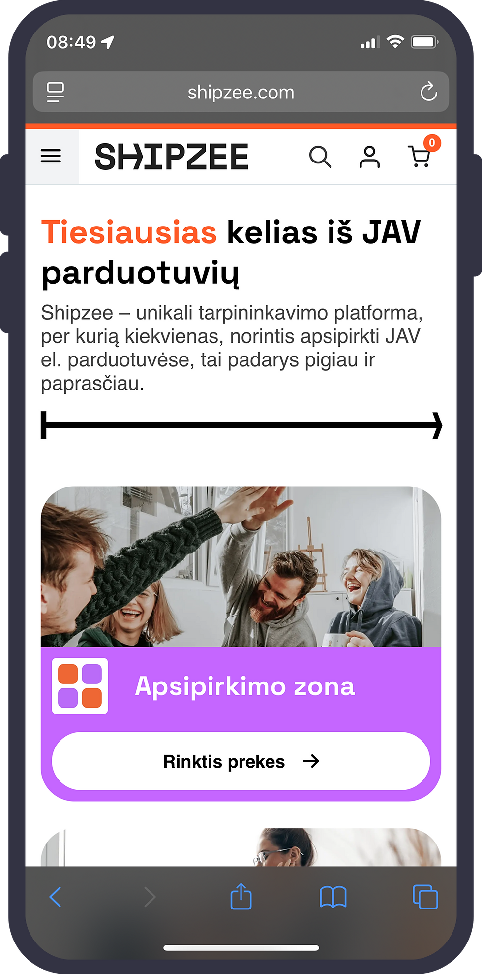
Step 3: Designing for Trust, Not Just Aesthetics
Here’s the truth: the average user doesn’t care about architecture. They care about clarity. And Shipzee had a clarity problem. So we asked ourselves: What if trust wasn’t built at checkout - but in the first five seconds?
We redesigned the experience with:
-
Clear messaging - How Shipzee works, explained upfront
-
Realistic delivery expectations - International timelines shown early
-
Transparent pricing - No surprises at the end of the flow
-
Guided navigation - A journey that felt smooth, not puzzling
-
A fresh UI - Clean visuals that reflected professionalism and reliability
From Friction to Flow
What changed after launch?
-
System speed increased
-
Security issues were resolved
-
Maintenance costs dropped
-
Users completed purchases with fewer questions and more confidence
The platform now supported Shipzee’s value not just technically, but emotionally.
What I Learned
A great service idea isn’t enough. If the product feels confusing, it is confusing. Clear communication, both through UX and UI, is critical, especially when you’re working with complex logistics or international regulations.
Sometimes, designing a better experience means rebuilding the invisible parts first: the architecture, the flow, the language, and the trust behind every action.